

How fast do you pull up Snopes when you see something you suspect to be fake news? Whether you're a veteran fact-checker or a more recreational news-browser, most of us are aware that the news we consume each day is at best, biased, and at worst deliberately misleading. This article, from the data team at Spur Reply, teaches the reader how to apply principles and practices from data science to their news consumption. While we’re using COVID-19 figures and news sources to illustrate the point, the principles are applicable to any situation where you’re trying to understand what’s important, and what’s not. Here’s how you get the most useful information (signal) out of the very noisy daily news.
Principle #1: Understand the context and proportionality of the data
Is $1,000,000 a large or small amount of money? Many would call a million dollars a “large” amount, and I would agree if you offered that to me that as an hourly wage. Most households in the United States could operate for 10-15 years with that amount in the bank. However, in the context of the US federal budget it is only one quarter of a ten-thousandth of a percent of the total. Put another way, $1,000,000 runs my household for 10 years but only runs the country for 7.9 seconds. Or put another way, the federal government spending $1,000,000 is proportional to my wife and me buying a banana (or a half of one if we’re shopping organic). When reading the news, a Data Scientist will try to understand the context and relative scale of the data presented. “That seems like a big number, how is that compared to last year? How is that compared to a week ago? How is that compared to the predicted trend?”
Let’s give a practical example. On April 10, 2020, an estimated 7,000 people died from the Coronavirus, 2,000 of them in the USA. These numbers are tragic, and to really understand them, a data scientist wants to know how many people would have died April 10 from other causes if the pandemic had never happened. The answer is 210,000 worldwide, with 8,000 of those in the USA. Based on historic numbers, 13% of these deaths would have been from coronary artery disease, 10% from stroke, 2% from HIV, 2% from tuberculosis, 2% from traffic accidents, and 2% from lung cancer.
From this we can calculate that April 10 US deaths from Coronavirus were 25% of the total expected for that day, and we can guess that, sadly, the April 10th US deaths from Coronavirus will be larger than the individual totals for HIV, tuberculosis, lung cancer, traffic accidents, and even stroke and coronary artery disease. We also see that the proportion of Coronavirus deaths outside the US is 2.4% of expected for April 10, and we can guess that worldwide April 10th deaths from Coronavirus will be less than stroke or Coronary artery disease.
Looking at the big (8x) difference between the proportion of Coronavirus deaths in the US versus the rest of world for that day, we should have questions (hypotheses) to propose and test with data.
For example:
- The US is one of the EARLY countries to have been hit by COVID due to a higher volume of international travel.
- The US is one of the LATE countries to have been hit due to being physically furthest from the virus’s point of origin.
- The US was slower than other countries to implement precautionary measures.
- Other countries are underreporting deaths due to lack of infrastructure for testing.
Calculating the predictive power of each of these hypotheses might lead to recommendations for action. For example, will we save more lives by implementing testing at airports or in regions underserved by medical infrastructure? Which Airports? Which underserved regions?
Principle #2: Know the limitations of the data
It feels good to pose hypotheticals about how we can save lives using simple correlations, but the Data Scientist understands there are inherent limitations in the real-world datasets we work with, and that the statistical and machine learning models we apply are by necessity over-abstractions of real-world complexity. No matter how much you want it to, or how much data you have, if it isn’t tailored to your problem or scenario, it may not be reliable or insightful. No matter how much data you have, if what it is describing has never happened before, it may be nearly impossible to use the data to determine how it will play out.
For example, when we think critically about the mortality data currently available, there are some obvious limitations:
- Emerging categories are under-represented: Coronavirus cases and deaths for January 2020 will have been under-reported because the medical community was not broadly testing for it at that time. As the Coronavirus mutates to new strains with different characteristics, it will again take a while for measurement to catch up.
- Real-world categories are entangled and not mutually exclusive: People with HIV are more likely to die when getting tuberculosis. People with HIV or Tuberculosis are more likely to die when infected by Coronavirus. Car Accidents might go down during a pandemic since less people are driving.
- Limitations in tools and techniques: In remote areas with limited technology, deaths may be miscategorized, or even missed.
- People misrepresent data: Lung Cancer is a top 10 killer worldwide, but we know that people’s self-reported cigarette use is lower than actual sales suggest.
- Organizations misrepresent data: Lung Cancer is a top 10 killer worldwide, but independent studies suggest that many governments are misrepresenting air quality.
It’s also important to analyze the assumed statistical model. For another example, we might look at the case rate in Hubei and observe that it appears to match a normal distribution.
Fig. 1 Hubei Timeline looks like a normal distribution with longish tail
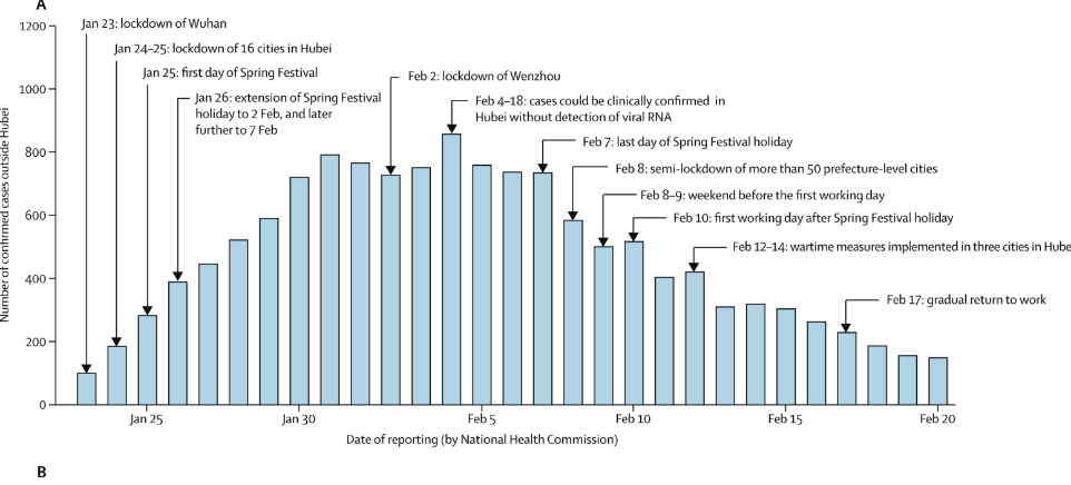
Source: The Lancet, Kathy Leung et. Al, April 8,2020
But when we try use that model predictively many different curves are in the realm of probability. And the nature of the curve likely depends on the demographics of the region and the preparedness steps taken by each country.
Fig 2. Here Italy and Iran seem to be converging
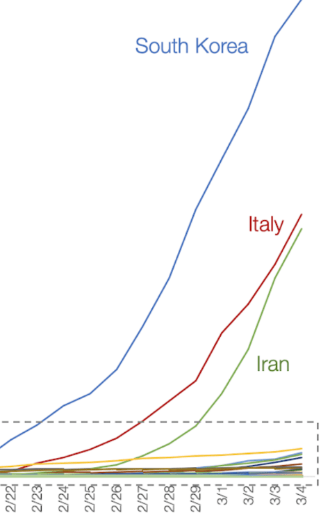
Fig 3. Two weeks later the actual curves were an order of magnitude different
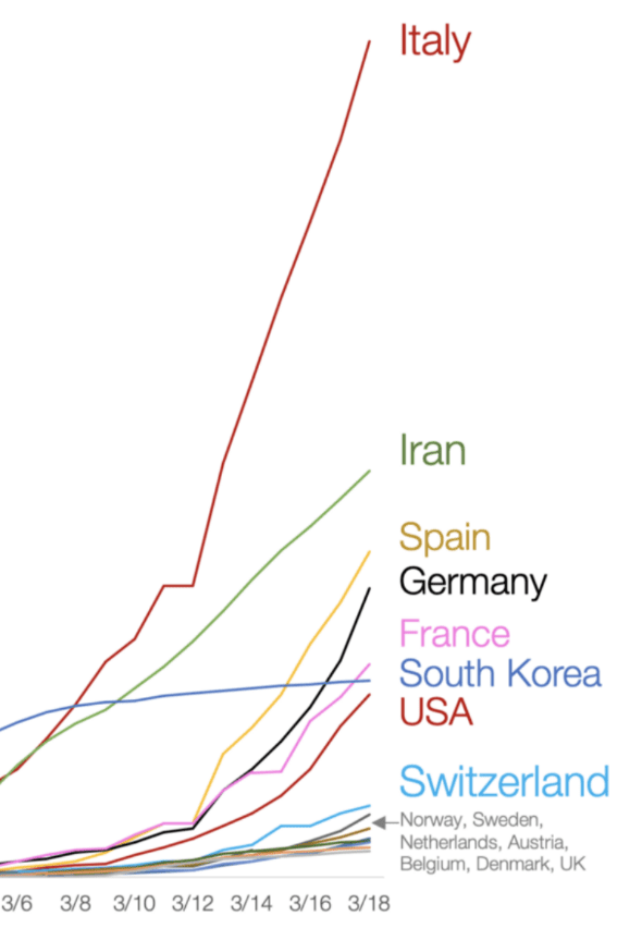
We must be cognizant of the precision and bias of the underlying data as well as the error in the model applied. In many cases, the bias, lack of precision, and model error compound to the point where the only responsible thing to do is to not make a prediction at all.
When the data scientist reads the news and sees a prediction of 250,000 cases, they recognize that the underlying models might have predicted a range of 125,000–500,000 deaths and done so with only 90% confidence.
Principle #3: Add new data only when it improves decision-making
In a system that employs a machine learning (ML) model, that ML model might be called multiple times per minute or multiple times a second. Once the model is trained on the underlying dataset, it’s very efficient at making complex sub-second decisions based on new input.
However, these ML models are often retrained (incorporating new data into the decision-making criteria) on a weekly, monthly, or even longer cadence. New inputs will continuously be acted on, but the best ROI is when the decision-making framework (the ML Model) stays static for a week or more, because the cost to incorporate new data is typically high.
Similarly, in the COVID-19 world we must constantly evaluate whether our actions are keeping us and our loved ones sage, but our underlying decision-making framework need not change that quickly. If you chose to watch or read the news only once week, but did it thoroughly, you would be almost as well-informed as someone who compulsively reads the New York Times Coronavirus updates every few hours.
The Data & AI team recommends only checking the news once per day, at the time that works best for you.
Our favorite sources for the current crisis include:
| Worldometer |
Cited as a source in over 10,000 published books and in more than 6,000 professional journal articles. Often they compile the raw data that is used by your favorite news source. |
| r/CoronavirusWA | A cross-news-source aggregator which surfaces the most informative and timely articles along with user-created updates. If you live outside Washington State you will want to find the subreddit focused on your particular geography. |
| Tomas Pueyo | An unlikely hero of the crisis, who’s self-published article Why you must act now became a rallying cry for millions. Tomas is a French-Spanish Silicon Valley entrepreneur who up until recently had written mostly about story-telling and popular culture. His article about the threat of COVID-19 captured the zeitgeist and played a role in mobilizing reluctant governments. |
| Gates Note | In 2015 Bill Gates gave a TED Talk on why we’re not ready for the next outbreak. He continues to provide thought leadership via his blog. |
Principle #4: Better data + better application = better decisions
As a society we are relying increasingly on historical data and predictive modelling to make key decisions, and we should welcome this trend. Data helps us see the value of vaccinations. Data allowed Bill Gates and other experts to predict aspects of the Coronavirus crisis with alarming accuracy. Statistical models are allowing countless efficiencies in our global distributions of goods and resources.
Let’s be optimistic! Once you have double-checked the data for currency, context, precision and bias, if the model indicates an outcome with a high level of confidence, embrace it and act. But let’s also foster our own inner Data Scientist who fact-checks the information they are ingesting and the conclusions they draw.
Principle #5: No data point is just a number
Finally, let’s remember to be human. Many of us are flooded by endless streams of data, and it can be easy to get desensitized. We must not forget that each number represents a fellow human. Someone with a family. Someone with a community. They are a person who is ill and frightened for their health, for their future, and worried for their family’s wellbeing.
Take the time to look beyond the data point, understand what it really means, and its impact and implications for people. To lose sight of that is to lose sight of our reality, of our purpose and ultimately of what makes us human.
